When I launched this blog, I had a vague idea of what I wanted it to be, but not how I was going to get there. And it had been that way for quite some time. I bought this domain back in college and I am almost five years graduated now. The lack of vision is what led me to delay doing anything useful with it. At first I just used it to host my resume, but I had already secured a job so that was not extremely useful. Plus LinkedIn provide way more visibility if that is all I wanted out of it. And as I tend to do, I put the idea on the shelf and thought about it from time to time, but never committed any time to it.
But then, this year I found myself especially motivated. Maybe it was the talks of my brother starting a podcast, or my friend starting to stream. Whatever the trigger was, I found myself desperately wanting to create my own personal brand. By personal brand i mean my public imagery and persona, my public self. This is how I want to present myself to the world. Maybe this is just a roundabout way of saying I wanted even a small amount of fame. I wouldn’t put it past myself to try and disguise vanity as something else.
As I have said previously, I wanted to develop new skills while I do this so I began generating some assets including a logo. My first attempt was not all that great. The imagery was too abstract. I knew what I was trying to create and could see it, but I doubt anyone else could. Never the less, in my excitement to get off the ground, I went ahead with it. I figured the look and feel of this place would evolve over time, especially as I figure out what I am doing, so I was not too concerned. Part of the reason I pushed for a rapid deployment was that I was afraid if I hesitated, the website would just go back on the shelf again, and that would be it for a while.
In this sense, I launched the website way too early. Practically speaking I should have waited until I had a consistent layout, and put together some content to make the site interesting. Maybe even show it around a bit and get some feedback on the design. But I was impatient, and launched early. I cannot really say that I regret this decision, because it did motivate me to actually follow through with the idea. But anyone can see that this site is immature, and I apologize for that. I will get there!
As I said, the design of this website is going to evolve over time as I learn more of the skills required to create a visually appealing website, and develop a personal brand for myself. After receiving some advise from a friend on the graphical design elements of my logo, I went in for version two. My fox logo needed to have a simplified color scheme, and more detail added so that you can identify it as a fox (or at least and animal of some kind). But I was really feeling the highly abstract line art, so I remained very abstract and basically brought together two oval shapes with two dots for eyes. It was a flat and clean design with good contrast so I ran with it. I updated the website, and changed my profile picture on social media platforms.
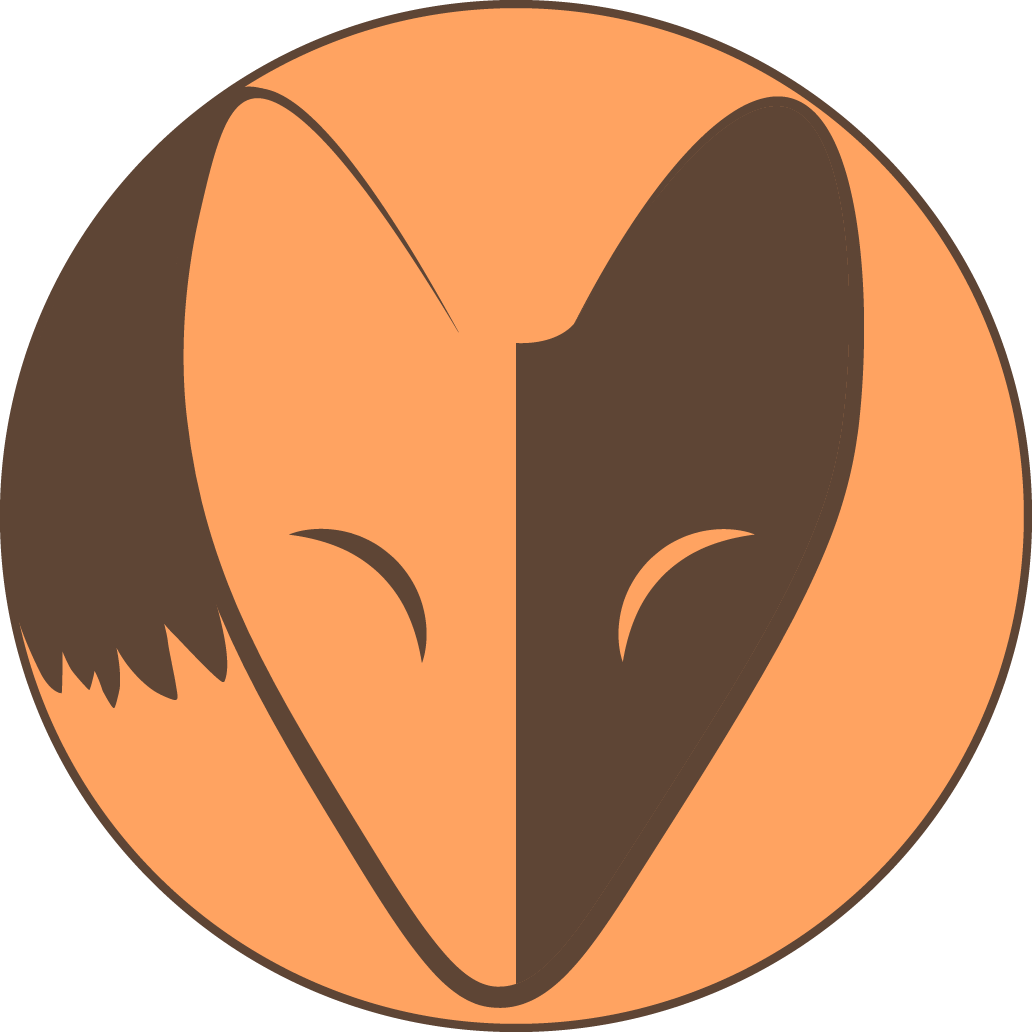
This all leads me to a rather embarrassing incident which I had not expected at all. A friend commented on the logo asking what it was. Knowing full well that I was being overly abstract with the design, I was not too surprised that someone would not see it as fox inspired. But after some discussion it became clear that what they were seeing and what I was seeing were very different indeed. I don’t want to go into too much detail, but they had interpreted it as something “not safe for work.” And of course once they said so, I could see what they meant. Lucky for me they gave me the benefit of doubt and talked to me before reporting me for using an inappropriate image. They recognized that I was just blind and not intending to be offensive. But that meant I needed an immediate redesign (again) since I had already started to use the image everywhere. Fortunately I am not trying to merchandise or I might have ended up with a whole bunch of embarrassing stickers sitting there mocking me. For my redesign, I added more details to the ears, and added a sweeping tail so that it should be much more apparent that it represents an animal. It is the current logo as of writing this post and should be visible at the top of the page. I also showed it to a few different people before uploading it everywhere, just to be safe.
The lesson here is that we can often become blinded by proximity. I was too close to the design I had been working on because I knew what it was that I was trying to create, and focused too heavily on that. This is not limited to art either. We can often times get too caught up in our own perspective, that we forget to think about how others may see things. While it is important to remain true to yourself, it is equally important to consult with others and be open to hearing what others have to say. They just might have some very important insight that you completely missed!
I am grateful to have friends who will tell me when I am wrong, even if I don’t necessarily want to hear it. I appreciate you putting up with me when I am being stubborn.
